Responsive website redesign
Project Date: March 2020 – May 2020
- USER RESEARCH
- UX DESIGN
- BRANDING
- HTML/CSS
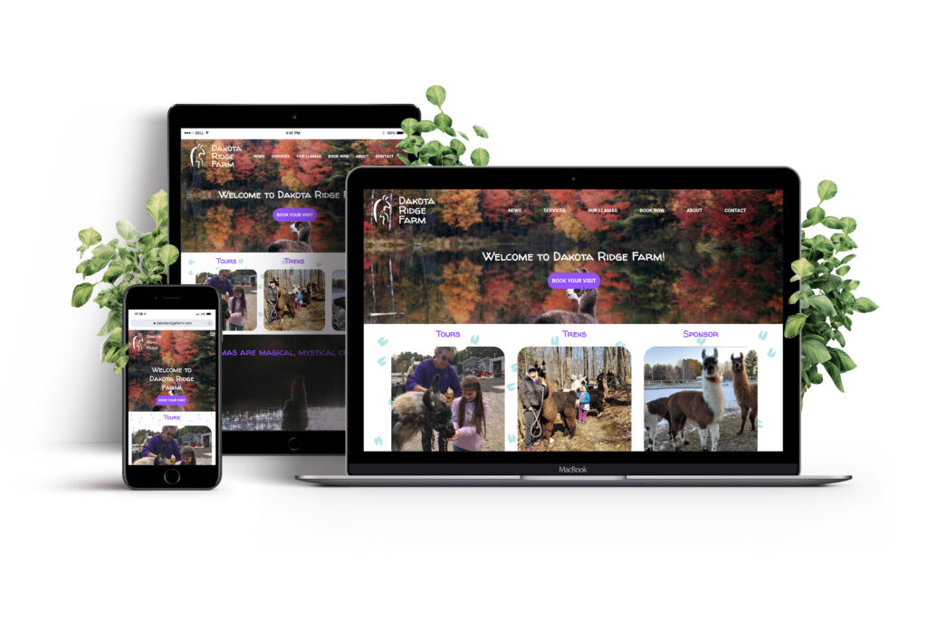
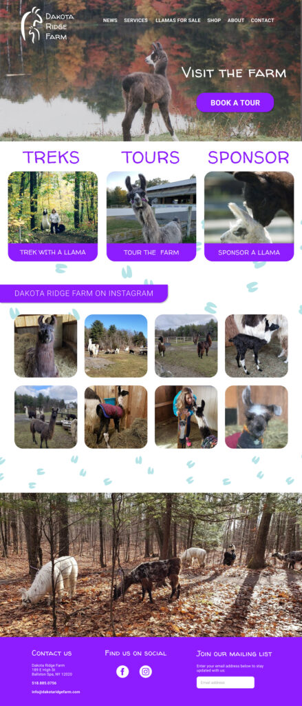
Dakota Ridge Farm needed a website redesign to have a more modern look and to improve responsiveness. They also wanted to add an online booking feature which would increase revenue for their primary services of farm tours and treks with the llamas. I worked on many aspects of this project which included user research, UX design, and branding. I was responsible for the HTML/CSS and worked alongside a developer to create this website.
User Research
User Survey
To refine our focus for the redesign, I created a survey to help me see what features would be most important in this process. I used the farm’s social media group to send out a typeform survey.
Survey Results
My survey results showed me that events at the farm were the top service that users were interested in. Another feature users wanted more of was photos of the animals at the farm. These results helped to guide me on what to focus on within the site redesign.
93%
of users were interested in events at the farm
47%
of users wanted to see more photos of the animals on the website
User Stories
I created user stories in order to prioritize the most important features for the website.
| As a new user, I want to learn how I can visit the farm |
| As a returning user, I want to book a tour |
| As a returning user, I want to sponsor a llama |
| As a returning user, want to attend an event at the farm |
| As a returning user, I want to see photos of the farm |
| As a returning user, I want to view llamas for sale |
Information Architecture
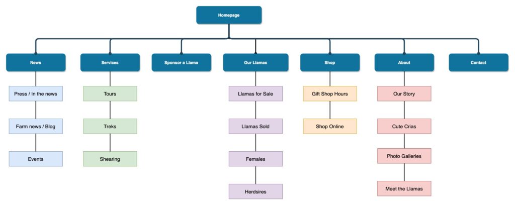
I worked with the owner of the farm to determine what her business goals are with the farm and where her current site was lacking. There were certain pages on her site that needed to be more prominent in order to promote aspects of her business that were being buried on the previous website, such as “Sponsoring a llama” and “Llamas for sale”, which are big parts of the farm’s revenue. I also took into account the responses from the user research.
Site Map
Design
User Flows
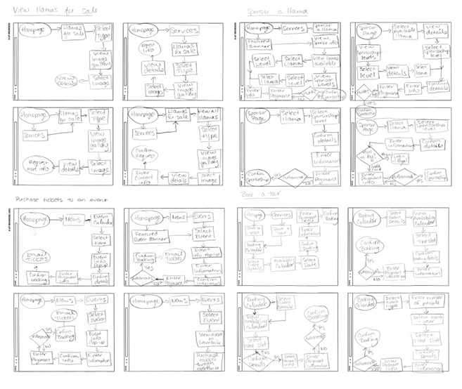
From the user stories, I sketched out various user flows for the highest priority tasks which included:
- Booking a tour
- Purchasing a ticket to an event
- Sponsoring a llama
- Viewing llamas for sale
Wireframes
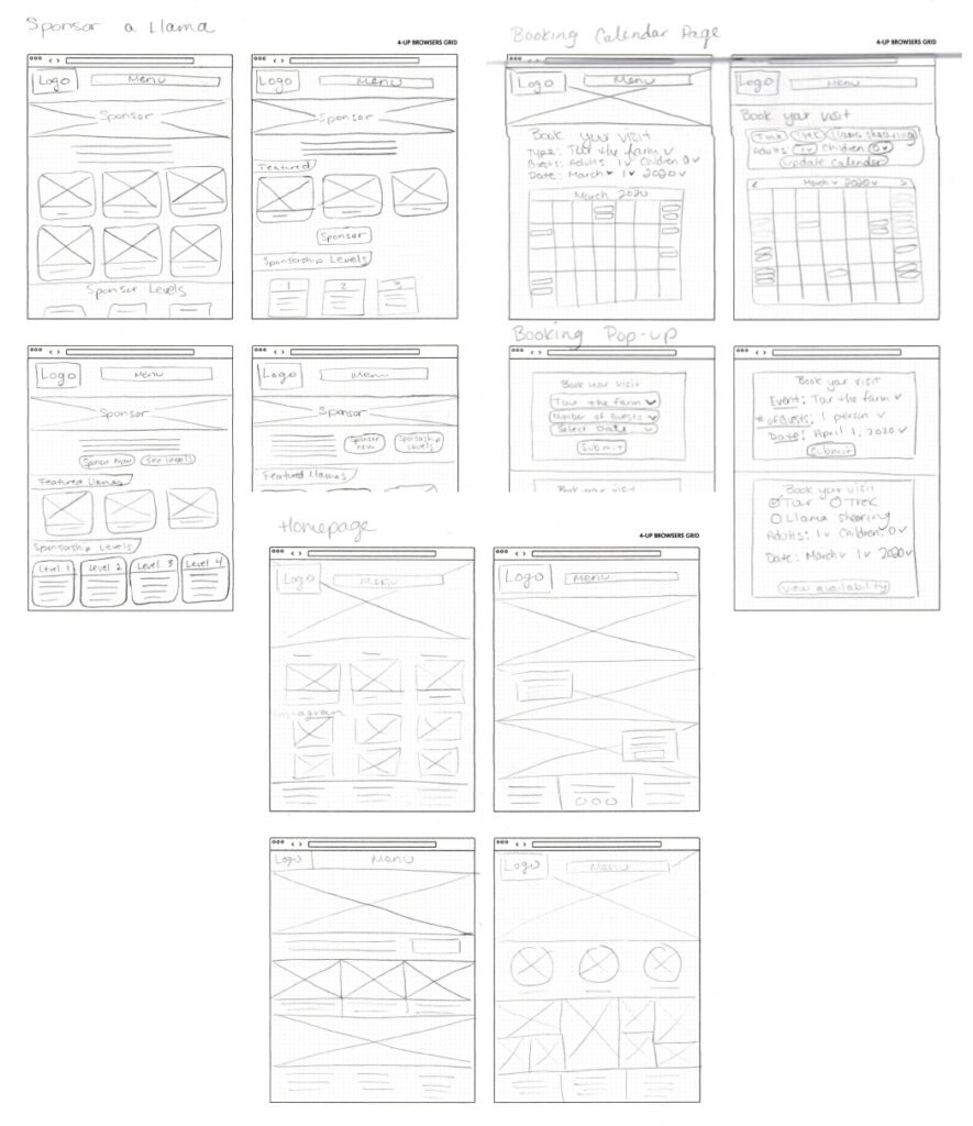
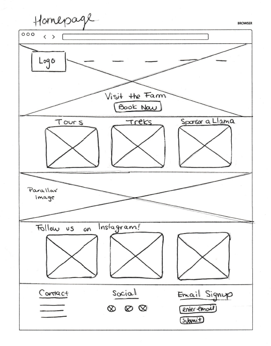
After determining the user flows, I sketched various ideas and versions of the most important pages on the site.
Branding & Style Guide
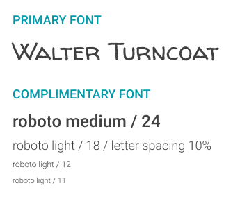
Dakota Ridge Farm already had a logo but they did not have any defined fonts or colors. I touched up their previous logo, we decided on the logo font, and I created a style guide for their brand.
Logo
Color Palette

Typography
Hi-fi Mockups
With the branding finalized, I moved on to designing hi-fidelity mockups in Figma. At this point in the project, I was showing the owner my designs, getting feedback and making adjustments.
Features
As we built the site, there were two main features that the developer and I spent the most time on: the booking calendar and the llama pages.
Booking Calendar
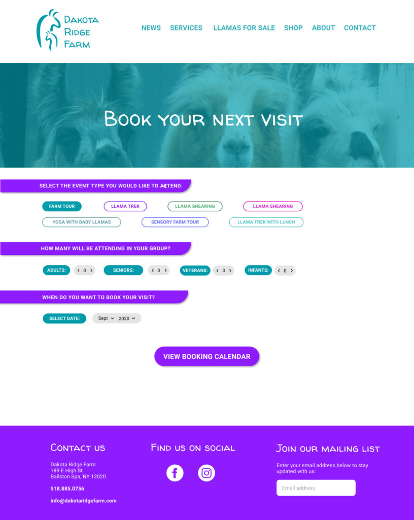
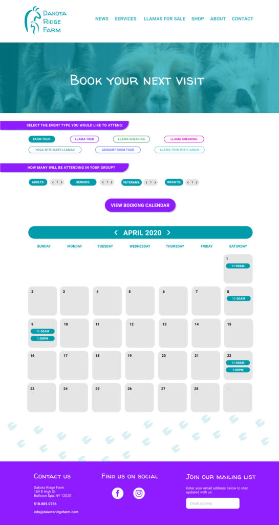
For the booking calendar, we integrated with the Bookeo API. The user selects the type of event, number of people, and the month before the calendar appears with booking slots available.
Individual llama pages –> Llama Lineage
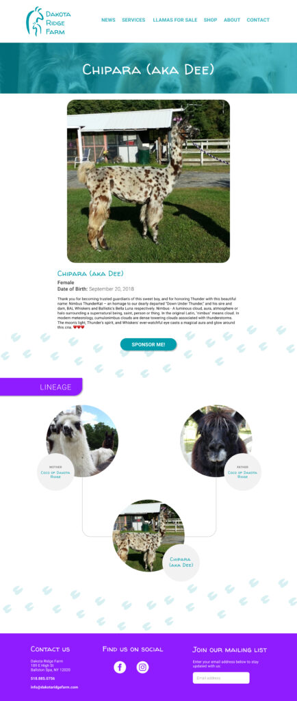
User research emphasized the importance of being able to look up llamas on the website either for viewing photos or sponsoring a llama. During the process of creating each llama’s page, we decided to also show the llama’s lineage.
The lineage is not only informational but can be a huge part of selling a llama, which is a big part of the farm’s business. In the end, we created a family tree type of design which will display on each llama’s page, showing their connections to other llamas. We have not seen any feature like this on any similar farm’s website and we think it will make them stand out against their competition.
Conclusion and Next Step
The owner and farm guests love the new website so far. The new booking feature saves time for everyone by allowing people to book and pay ahead of time. We hope to fully integrate a booking system within the website instead of using an API and third party, to make the process even smoother for the user to book.
In regards to the lineage and llama pages, we plan to make a full directory of llamas on the website which will make the lineage even more robust. Since llama sales are a huge part of the farm’s business, I think this will add a lot of value to the site and it’s a feature that no other competitor is doing.
